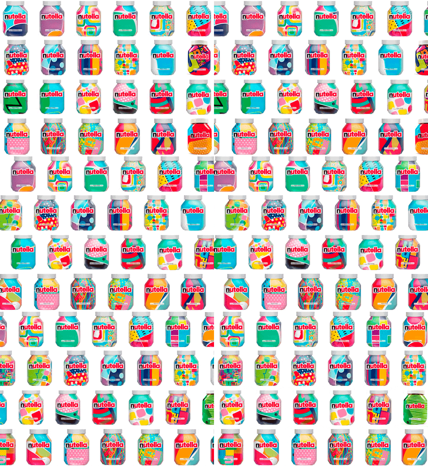
Our Top 6
01. Minimalism
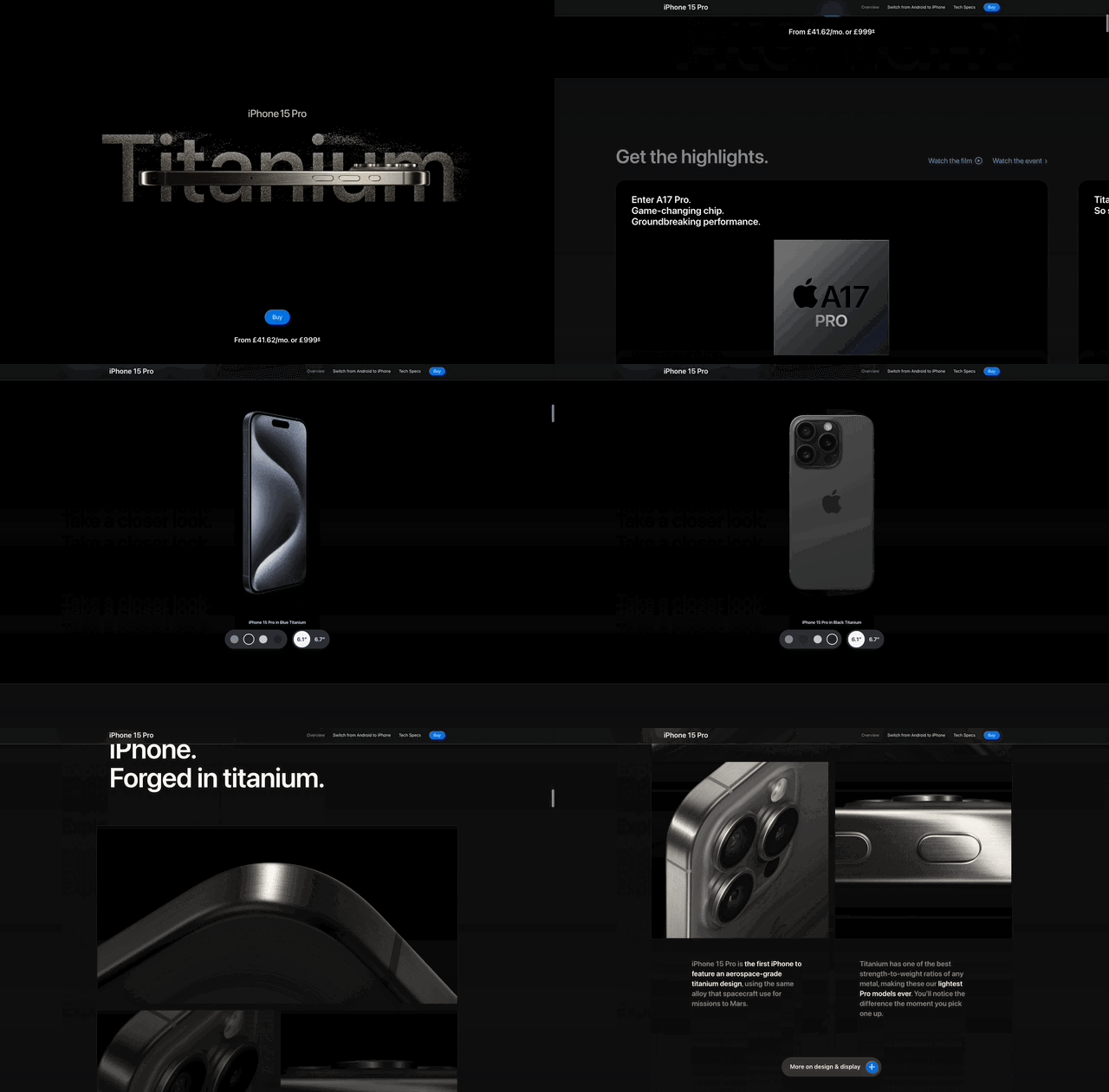
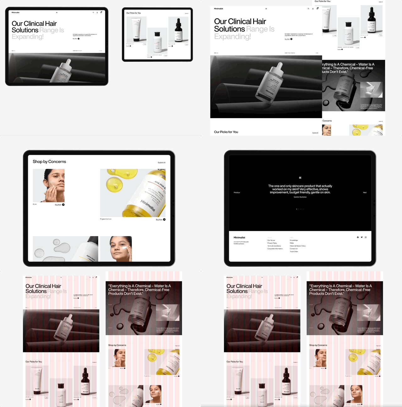
Minimalism is a timeless design approach always to have in mind. Its basic principles are to emphasise simplicity and the removal of unnecessary elements that may distract the user from what is important. It's about removing all the clutter and owning only what adds value and meaning to your website or digital application.
It derives from the minimalist art movement that started in the late 1950s, mainly in the United States of America, where artists like Frank Stella, Carl Andre, Donald Judd and Agnes Martin were some of the movement's most important innovators.
"What you see is what you see." - Frank Stella
Key Principles for Digital Design
A few principles should apply when it comes to designing a minimalist website or application.
Less is More
As mentioned above, simplicity is the key to a minimalistic design. So focus on what is really important. Limit your font choices to a maximum of two, use a balanced and short colour palette and reduce the amount of graphical elements on the page. Keep the User Interface clean and easy to interact with.
Functionality above all else
Each element or component should be placed purposefully with a goal in mind. If it does not serve a purpose, it should not be on the page.
Simple Typefaces
The importance of font faces and typography can not be emphasised enough. Important as they are in graphic design, typography plays a pivotal role in relaying the message to your users. As above, the functionality should outweigh visual aesthetics, which is why you should choose a readable font. Sans-serif fonts like Helvetica, Futura or Montserrat are always safe options.
Visual Hierarchy
You want your audience to immediately grasp the information. Guide the viewer's eyes through a well-structured page, highlighting the relevant information first.
Proportions, proportions, proportions
Be careful on how elements interact with each other. Be aware of the white or negative space and how you can use it to highlight features or information. Grid layouts are a safe bet, but having a well-planned design system and patterns will help you greatly in the future.
02. Neo Brutalism
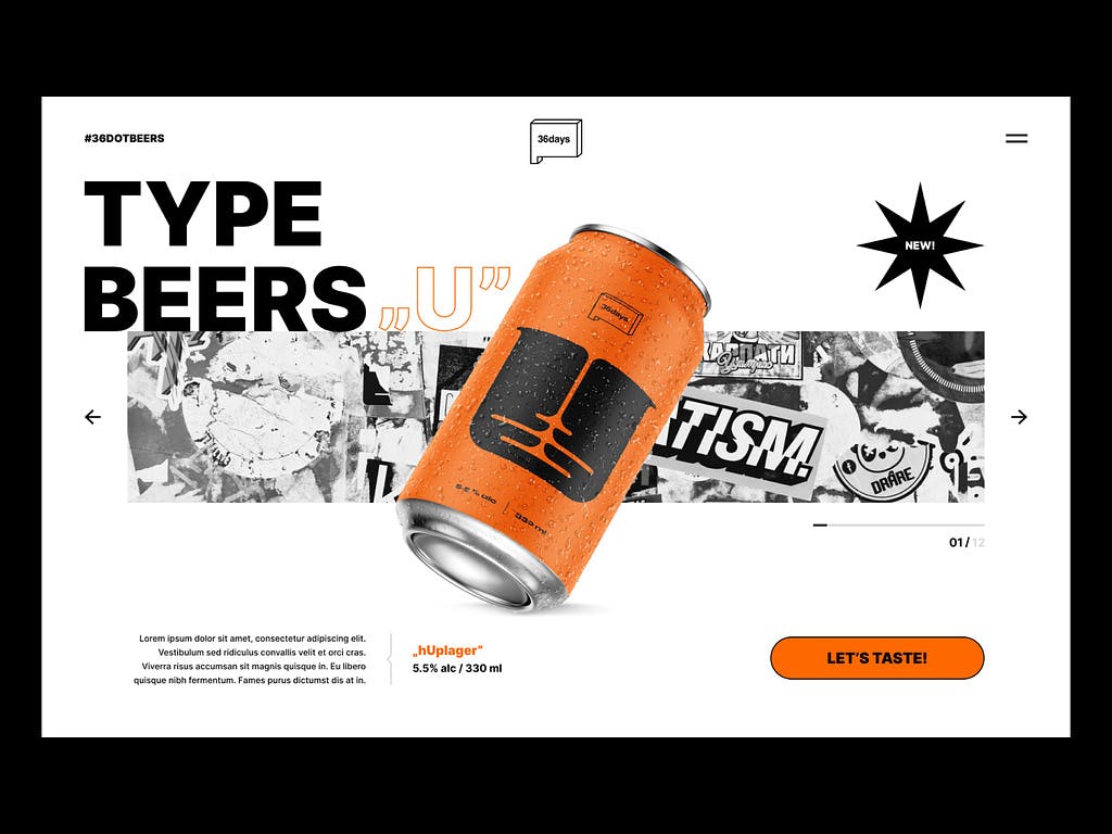
Brutalism or Neo Brutalism, feels like the polar opposite of Minimalism, however it follows some of the same principles, elevated to a different level. It should be bold and powerful. Sometimes hideous but always unapologetic.
The term is derived from the French beton brut, meaning "raw concrete." It refers to the Brutalist architecture movement in Western Europe that lasted between the 1950s to the 1970s. It made is way to the digital world around 2016 where it took advantage of Javascript and CSS to create sophisticated and bold animations.
Key Principles for Digital Design
Readability?
One of the main purposes of a website is to deliver content. Brutalism takes this concept to the next level, increasing the size of these elements to the extreme. Bold and massive headers, exaggerated hyperlinks, full bleed animations or patterns are some of the key features.
Over the top Typography
The kinkiest the better! And it's not all about size. Unconventional shapes, hand-drawn or pixel typefaces, bright and colourful outlines. Anything goes and the only limitation is your imagination.
Infinite Tension
A common visual idea behind most Brutalist websites is tension. It is often created by overlapping elements, playing with different perspectives or parallax effects or by removing the white space between them. By creating the sense of interlinked multiple dimensions.
Back to the Origins
As the graphic movement took inspiration on its architectural roots, the digital movement often refers to the origins of the internet. The 3D looking interfaces, bright neon colours, the tiled patterns and ASCII drawings are often used in these visuals.
Ugly as the new Beauty
Be honest and sincere. Brutalism gives you the freedom to be yourself, develop your vision and break rules if you feel like you need to. Although it aims to be convenient and understandable, it can often be perceived as outrageous and unconventional. Either way, is a great way to stand out from the crowd.
03. PixelMania
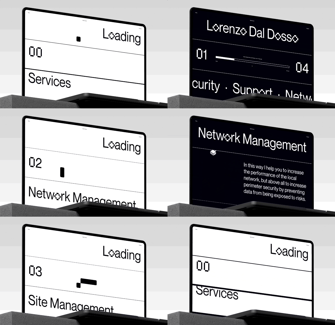
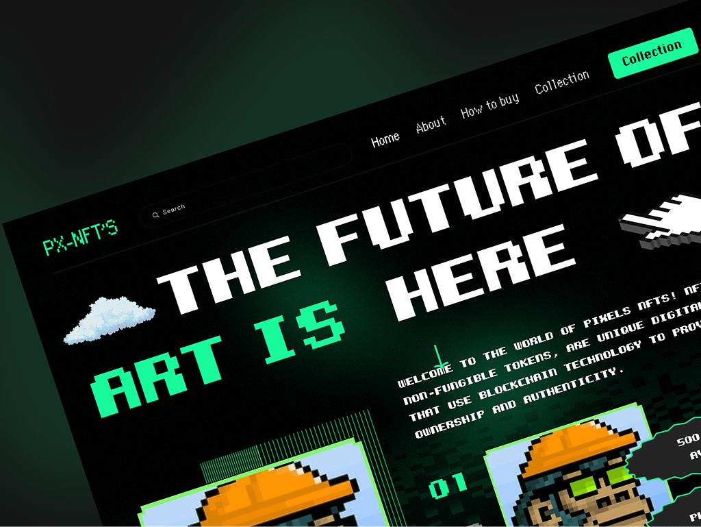
Another trend returning to our screens is the use of Pixel typography and graphics. But this time, together with modern graphics, patterns and layouts. Combining the retro 8-bit look of the 70s with modern 4K graphics and footage guarantees a modern look.
04. Glass Reeded Effect
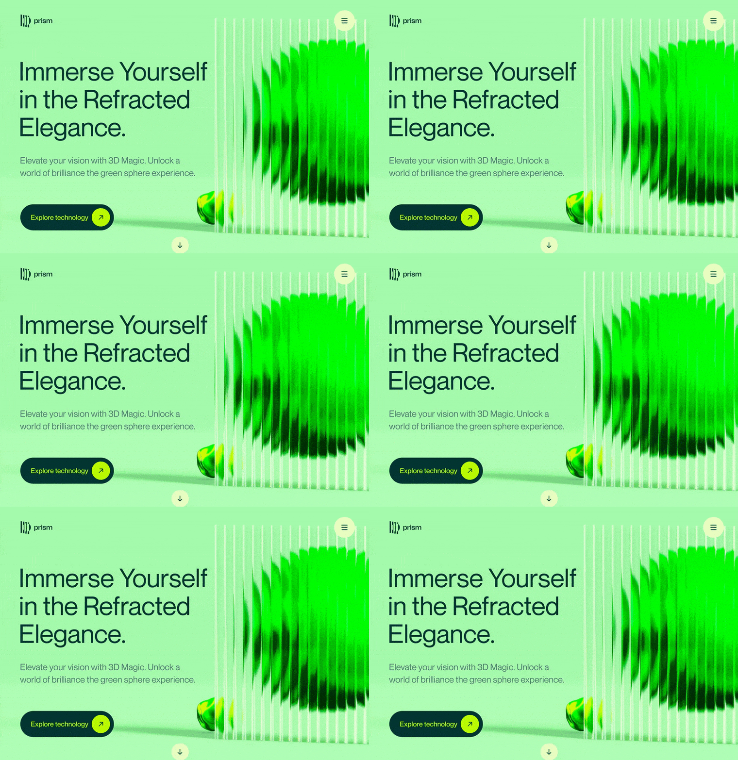
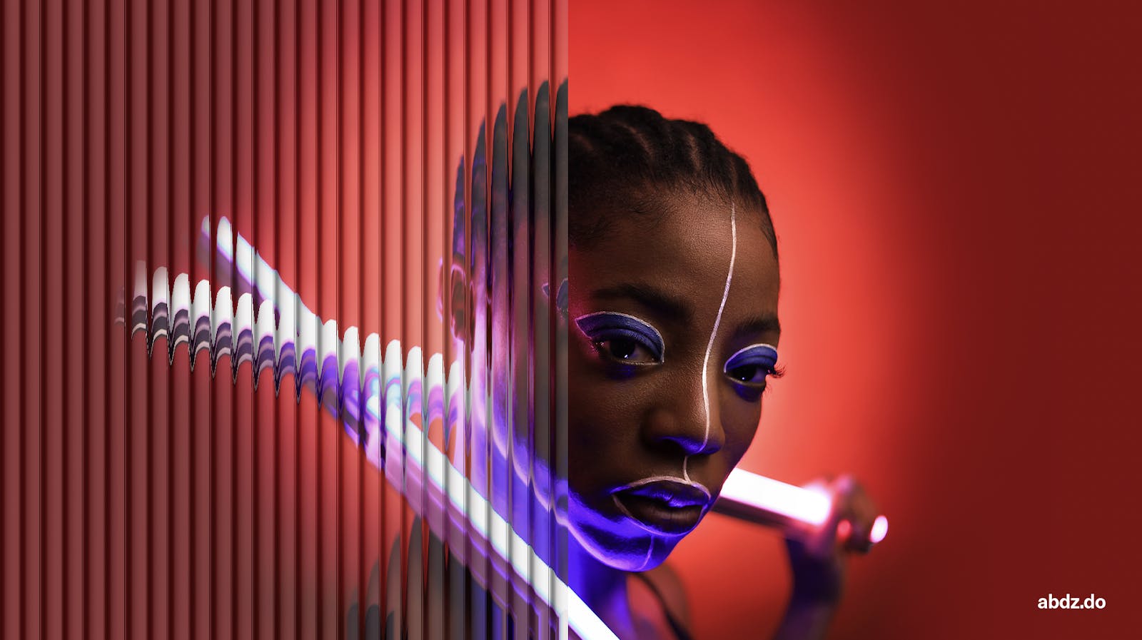
Glass-Morphism and other glass patterns like the reeded wall effect are also back. Placing some elements or products behind a glass wall will give a sense of depth and perspective to your website or landing page.
05. Micro Interactions
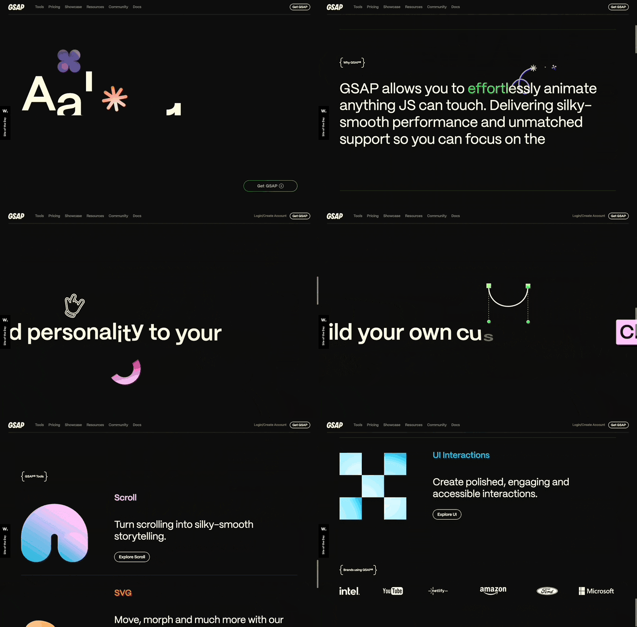
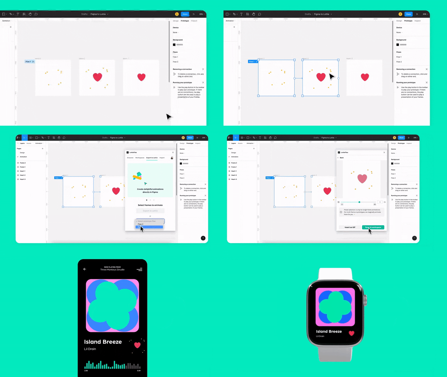
As we explained in our article about The Art of Micro-Interactions, these small but purposeful animations will be hot in 2024. They enrich the user-experience and allow brands to tell a little bit more about themselves and connect with their audience without being too intrusive.
06. Artificial Intelligence
Our final digital trend is, of course, Artificial Intelligence progressing into websites and applications.
Images and Illustrations generated by tools like MidJourney, DALL-E 2 or Adobe Firefly will start to make their way into layouts.
But more importantly is to take advantage of AI to provide new features for your users. Allowing your users to generate their own avatars, dynamic photos or models of your products, helpful chatbots or AI-powered searches or suggestions are a few of the innovations.

